
Torch Proxies
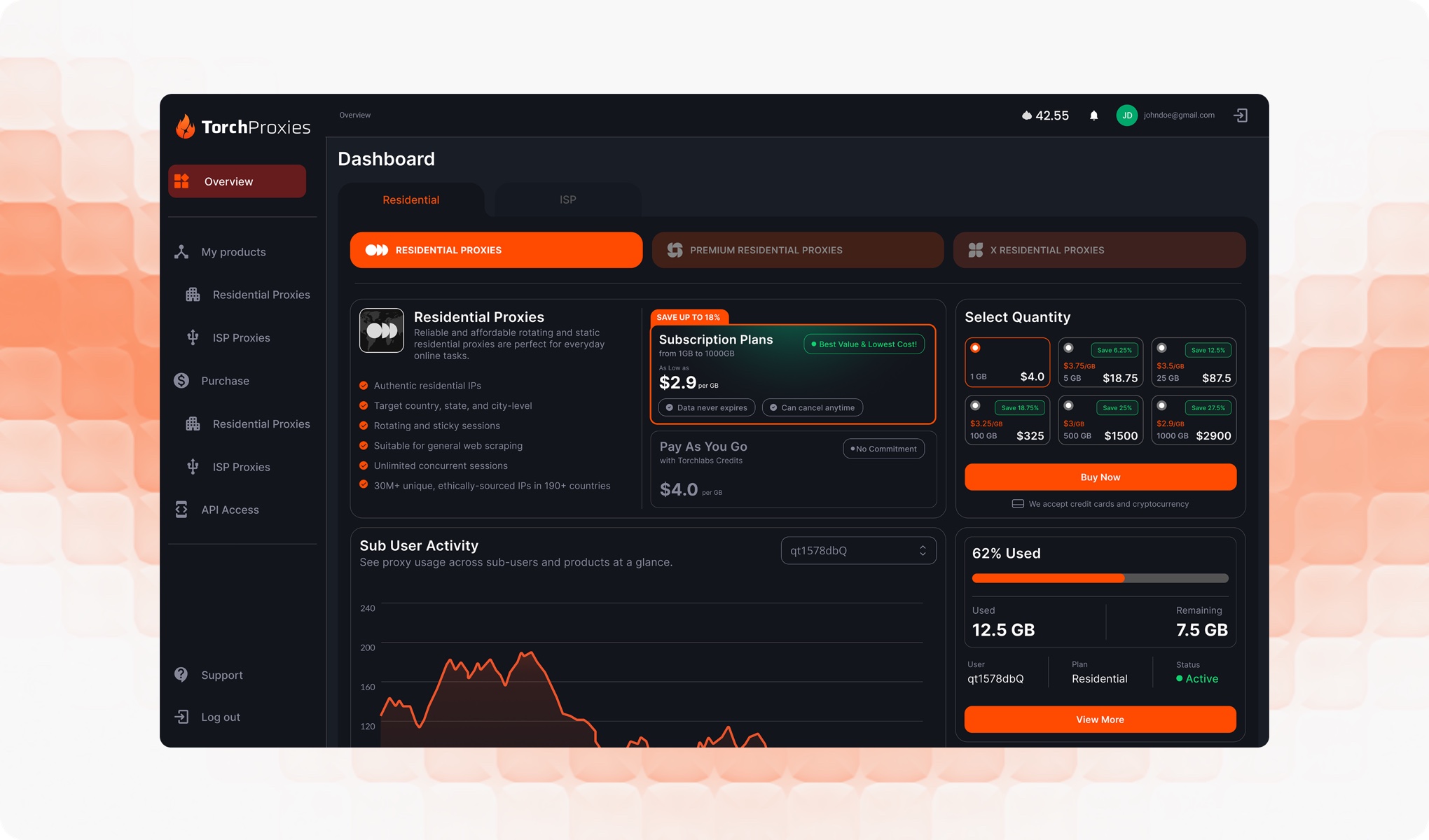
Torch Proxies is a self-serve platform for purchasing and managing residential and ISP proxies. Within the dashboard, users can create proxies by configuring a sub user, country, authentication type, session type and quantity.
The system knew when a proxy couldn't be generated. The user didn't. A sub user's remaining data determined whether generation would succeed, but that information wasn't visible in the flow, users could complete the entire configuration and only find out they were short on data after pressing Generate.
The generation flow had a hidden prerequisite
Generating a proxy consumes data from the selected sub user's balance.
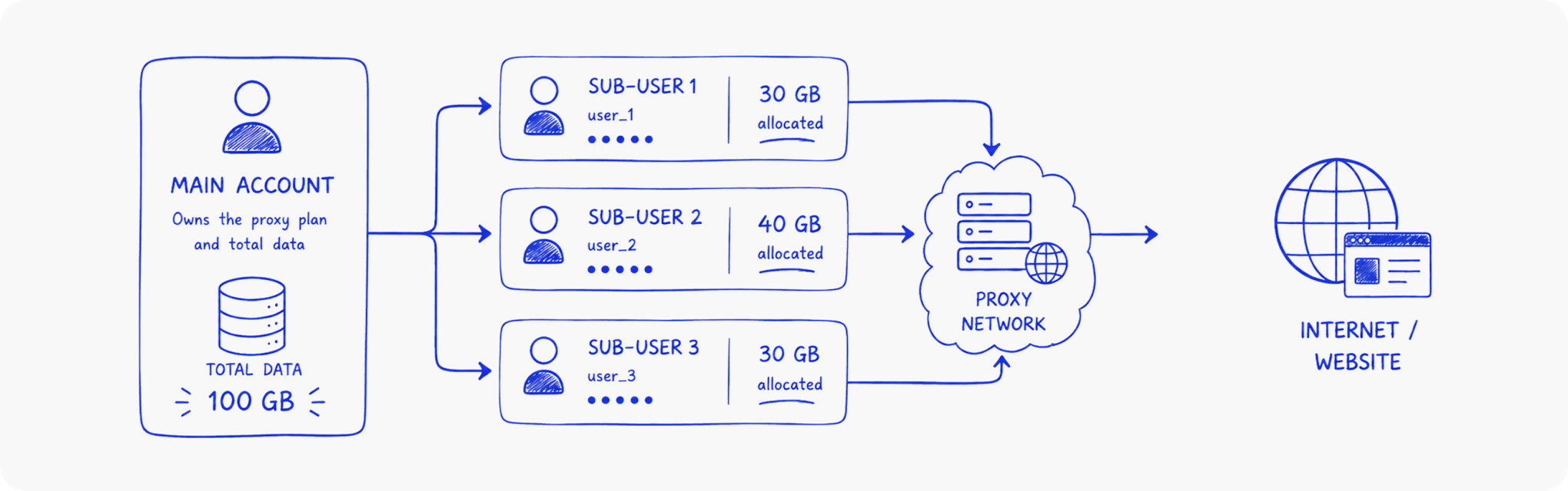
A sub user is a separate account under the main account, each with its own allocation of purchased data.
The problem was that the generation flow depended on this balance without exposing it.
The existing flow looked roughly like this:
Select sub-user → Country → Authentication → Session type → Quantity → Generate
The balance was only checked when the user attempted to generate the proxy. If the sub-user didn't have enough data, the request failed.
The system had the information. The interface didn't.
The system had the information. The interface didn't. That meant someone could spend time configuring a proxy only to discover at the final step that they couldn't actually generate it.
The failure wasn't necessarily in the validation itself. It was in when the constraint was communicated.
Tracing where the failure entered the workflow
Started by mapping the generation flow to understand what information the user and system had at each stage.
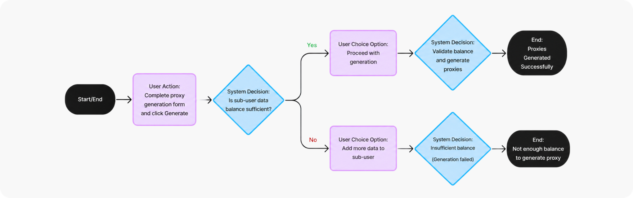
The balance was a prerequisite for completing the task, but it wasn't part of the user's decision making process.
Stage
What the user sees
What the system knows
Select sub-user
Which sub user is selected
Their remaining balance
Configure proxy
Country, auth, quantity etc...
Whether the balance will be sufficient
Generate
The action to create the proxy
Balance is validated
Failure
An error message
The request cannot proceed
This exposed the underlying issue. A critical system constraint was being revealed at the point of failure instead of the point where the user could act on it.
That created two problems.

1. The constraint was invisible
There was no way to know how much data the selected sub-user had before starting the configuration.
2. The failure had no useful recovery
When generation failed, the error didn't clearly explain what had happened or provide a direct path to resolve it.
The user was left to figure out where to update the sub-user's balance or look through documentation for the answer.
The opportunity was bigger than showing a number
The obvious fix was to display the remaining balance. But simply adding a number wouldn't solve the whole problem.
The information needed to answer three questions at the right moment:
- How much data is available?
- Can I generate with this account?
- If I can't, what can I do about it?
That led to a simple design principle. Surface the constraint before the commitment.
Instead of allowing the user to discover the problem after completing the form, the interface should make the selected sub user's state clear before they invest effort in the configuration.
Exploring how the balance should appear
I explored a few ways to introduce the information without disrupting the existing generation flow.
Inline Balance
The first approach placed the remaining balance directly beside the sub-user selector.
It kept the change lightweight and connected the information to the account it belonged to.
But the balance was important enough that it risked becoming just another piece of text in the form.
Progress Indicator
I also explored representing the balance visually through a progress bar showing used versus remaining data.
This made the relationship between usage and capacity easier to understand, but introduced more visual complexity than was necessary for a simple account state.
A contextual status block
The final direction treated the balance as part of the selected sub-user's state rather than another field in the form.
That allowed the interface to communicate more than just a number:
Usage → Remaining balance → Account status → Next action
This made the information harder to miss while keeping it directly connected to the sub-user the user had selected.
Making the system state visible
Once a sub-user is selected, the new status block immediately shows their current data state.
Active state
The user can see: data used, data remaining and account status
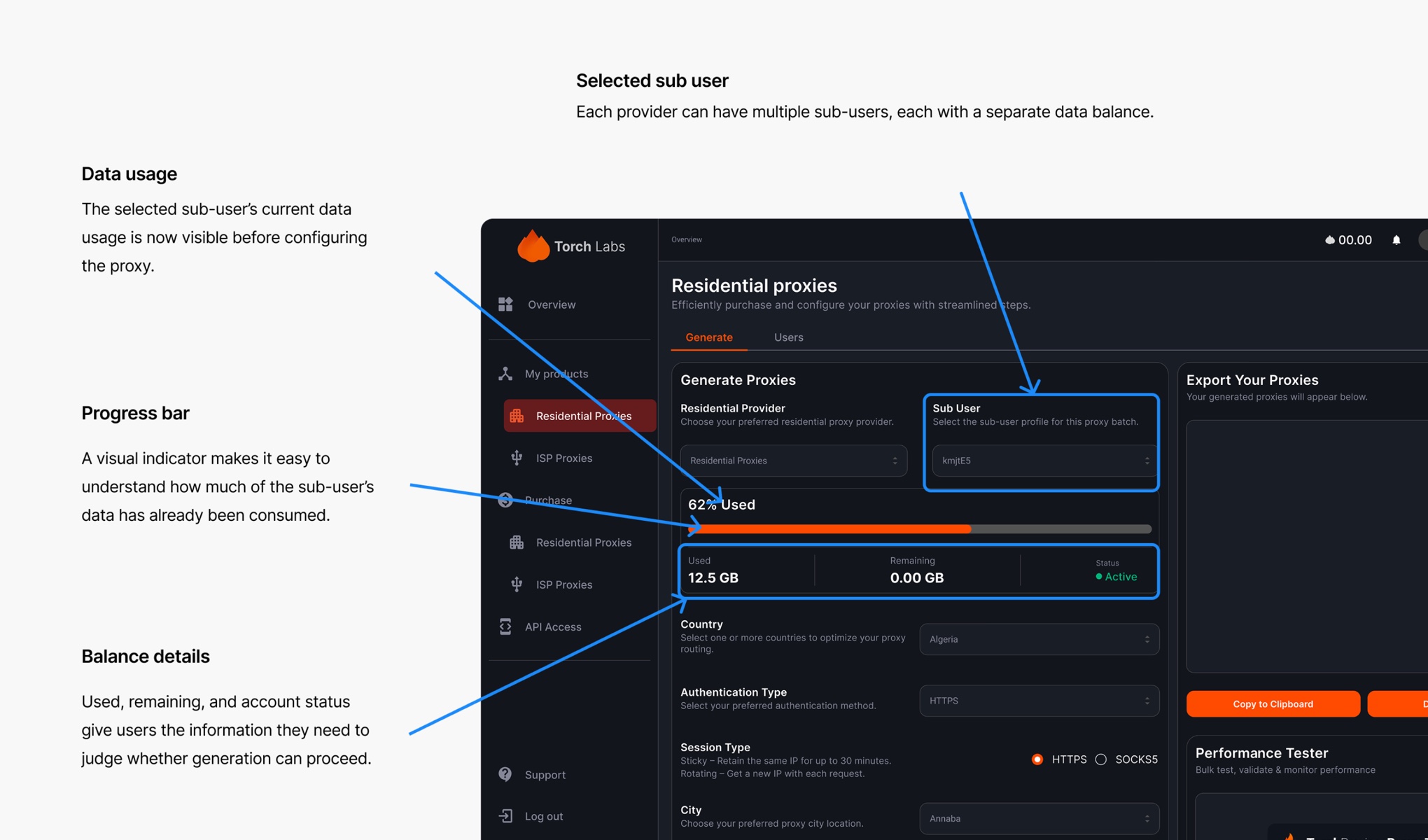
The balance is now available before they begin configuring the proxy. There is no need to start the process and wait for the system to tell them whether they can finish it.
Designing for the failure state
The zero-balance case was just as important as the normal state.
If the balance reaches zero, the status block changes to clearly communicate that the sub-user is inactive.
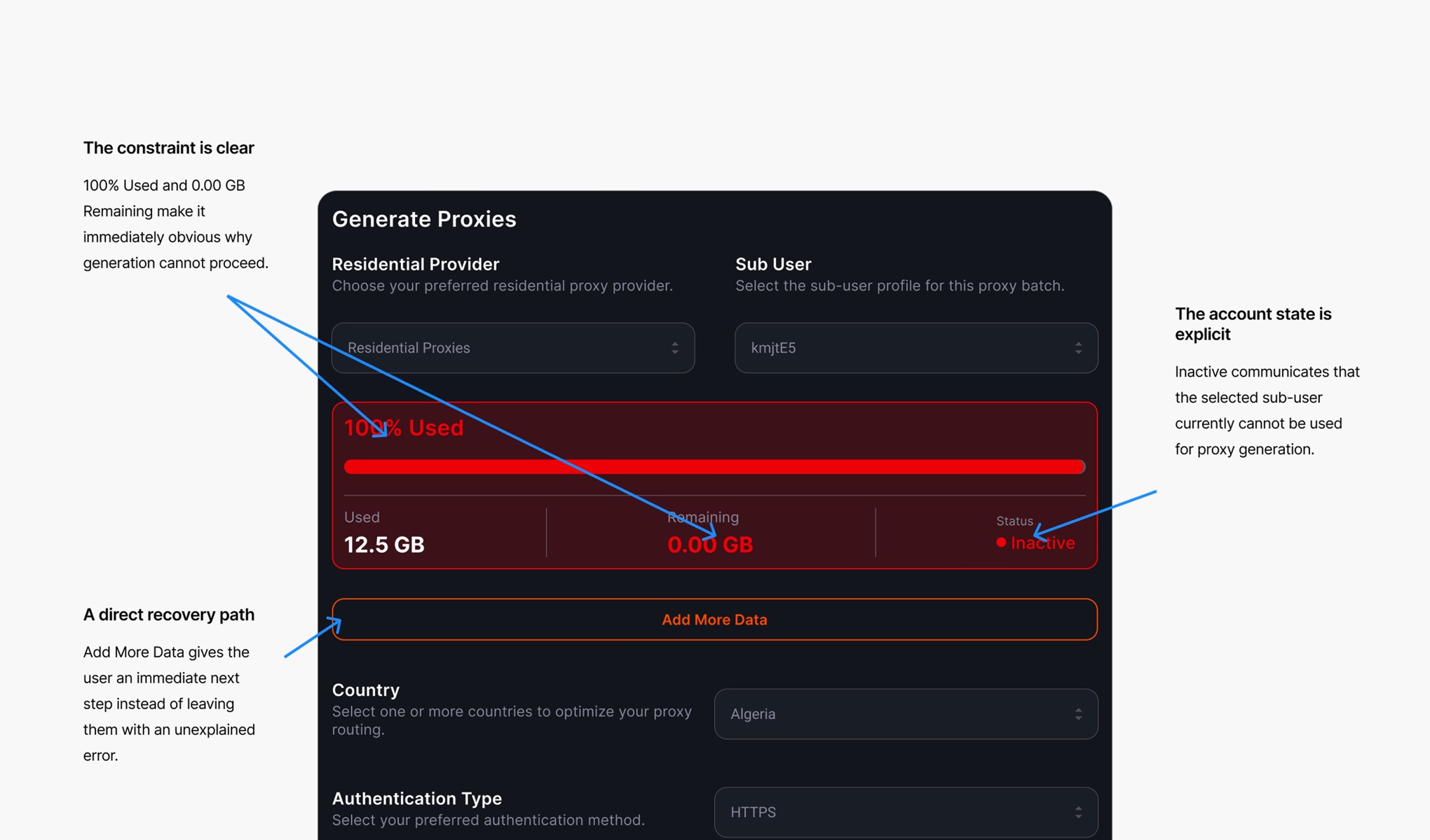
Instead of ending with an error after the user has completed the form, the interface now tells them:
0 balance → Inactive → Add more data
A direct action takes them to that sub-user's page where they can add more data.
The recovery path is therefore part of the state itself.
From failure to informed action
The original experience made the user discover the constraint at the end:
Configure → Generate → Fail → Figure out why → Find where to fix it
The redesigned experience moves that information forward:
Select sub-user → See balance → Decide whether to continue → Generate
And when there isn't enough data:
Select sub-user → See inactive state → Add data
The system no longer waits for the user to encounter the problem before explaining it.
What changed
The redesign wasn't about adding another card to the interface. It was about changing when the product communicates an important piece of system state.
A balance that previously existed as an invisible prerequisite became visible at the point where it could influence the user's decision.
The zero-balance state also became an actionable state rather than a dead end.
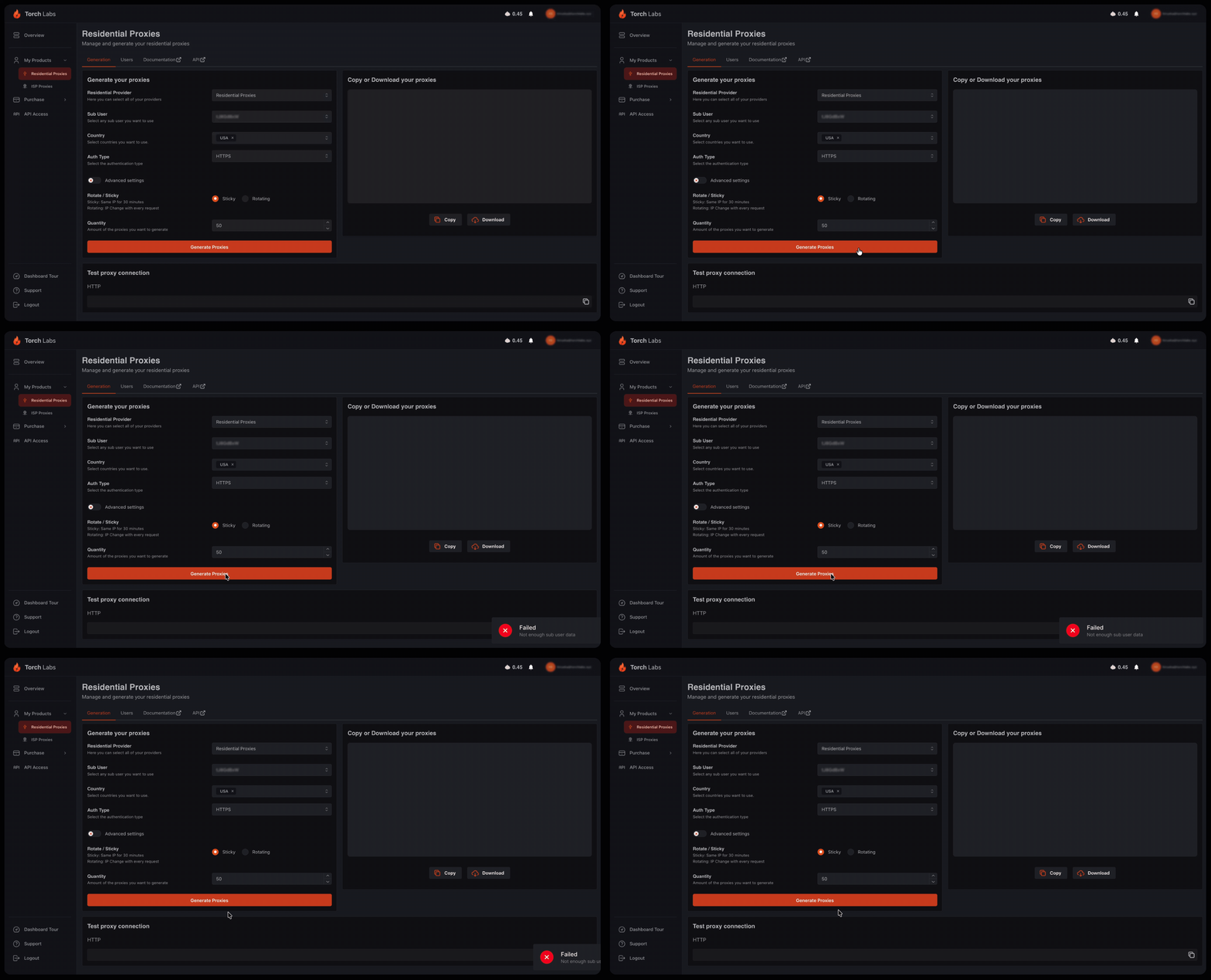
Before
The system validates the constraint after the user commits.
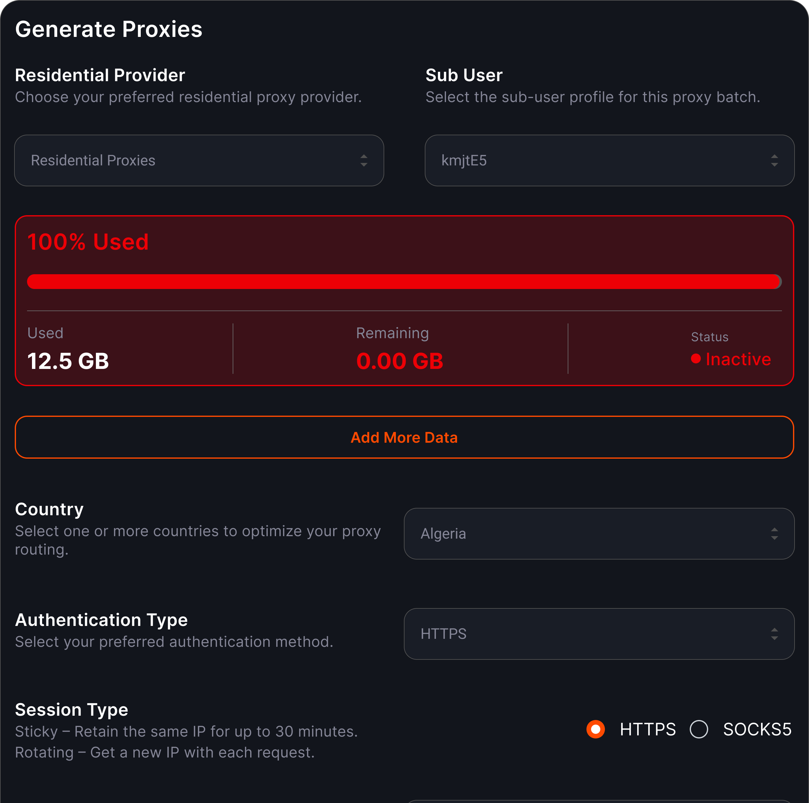
After
The interface exposes the constraint before the user commits.
This was one of several improvements made as part of the broader Torch Proxies dashboard overhaul.