Octo Proxies
Octo Proxies is a concept project exploring how a proxy brand could have a more distinctive and flexible visual identity.
The goal was to move away from the usual technical visuals used by proxy and infrastructure brands and create something that felt more modern, simple and recognisable.
The Idea
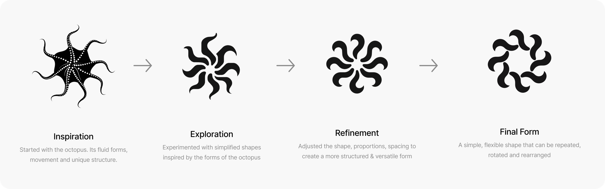
The idea started with the octopus. Instead of creating a literal octopus logo, I explored some of its characteristics such as adaptability, reach and control and turned them into a visual system.
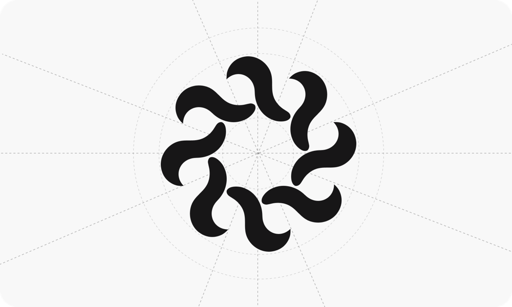
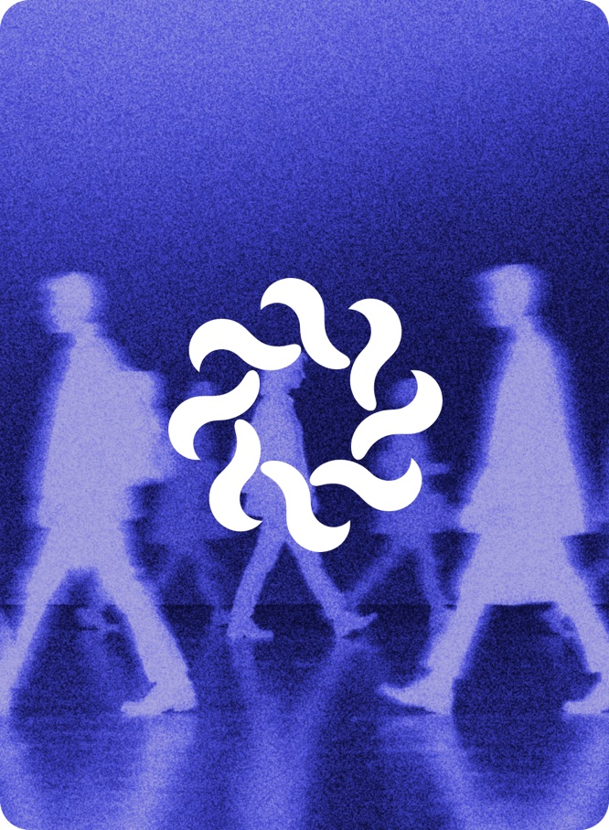
The obvious approach would be to create an octopus illustration. I wanted to take the idea further. I used the curved forms of the octopus as inspiration and developed a simple geometric shape that could be repeated, rotated, and rearranged.
This became the foundation of the Octo Proxies identity.
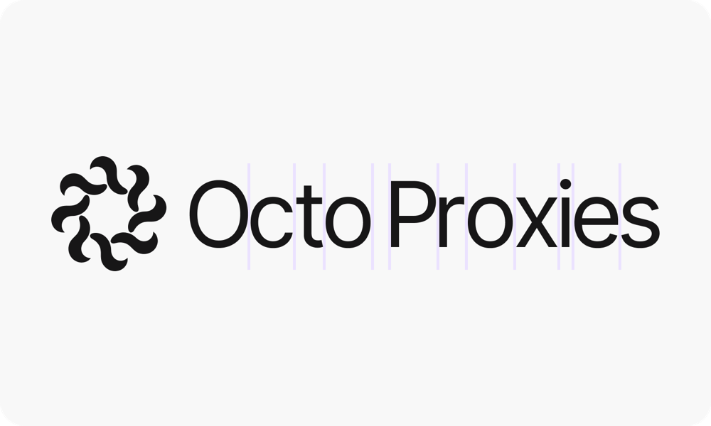
Visual pillars inspired by core values
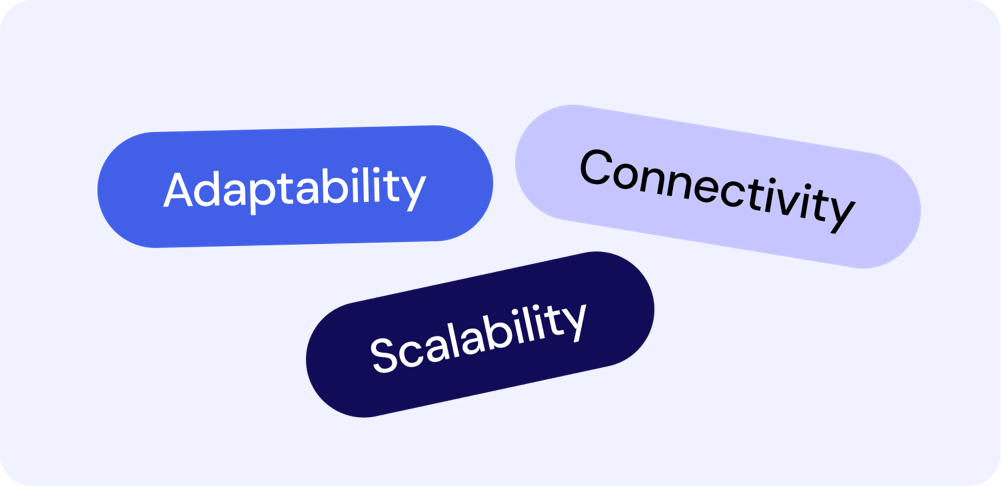
The visual identity is built around three core values of Octo Proxies: Adaptability, Reach and Control.
Each value inspired a different visual direction, helping shape the motifs and graphic elements used throughout the brand while keeping the overall identity consistent.
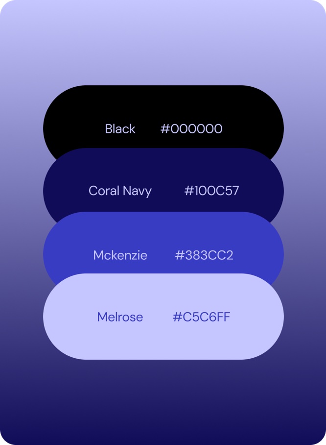
A clean, modern type system, dark digital colour palette and flexible graphic language come together to create a consistent and distinctive visual identity across the brand.

Bringing the identity into the digital world
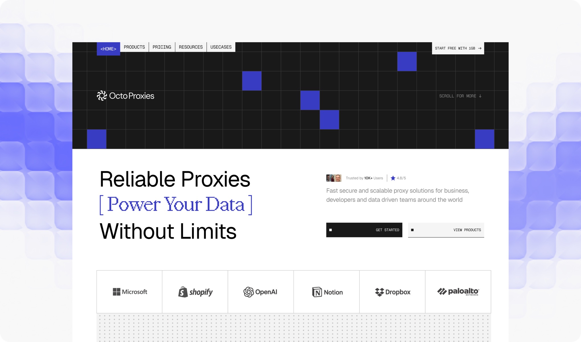
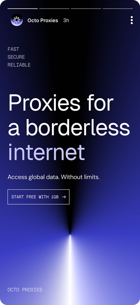
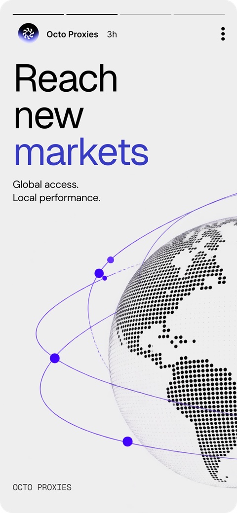
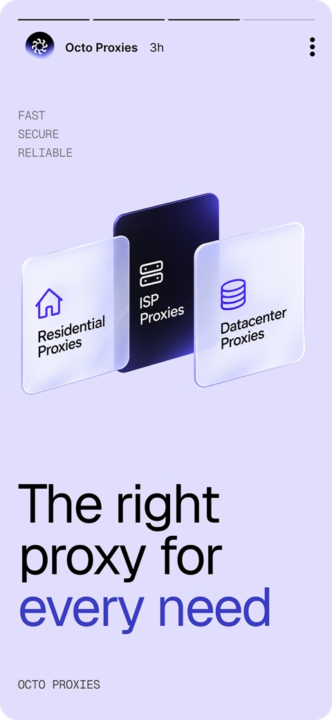
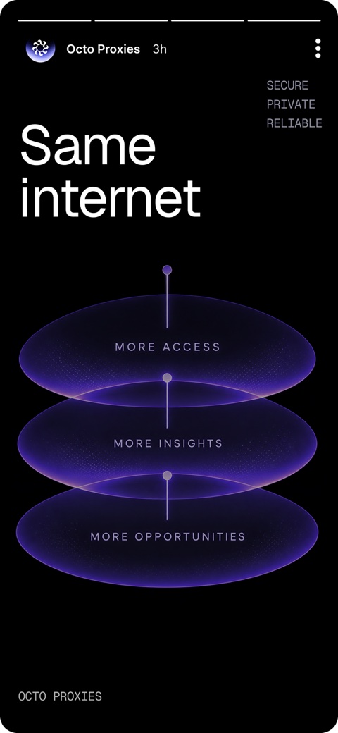
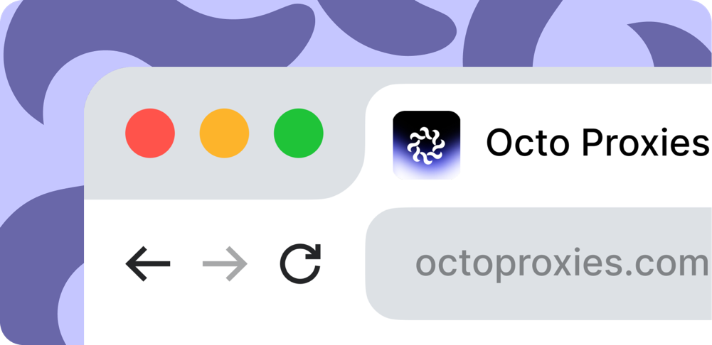
The visual system was applied across digital touchpoints to see how the identity performs in real situations.
From website layouts and UI elements to social graphics and brand assets, the system was designed to remain consistent while adapting to each format.