
Jink Host
Jink Host offers VPS, RDP, cloud storage, dedicated servers and domains. That sounds straightforward. Until you try to put all of it on one landing page.
There are different products, server locations, performance tiers, configurations and use cases to explain all to people who may not necessarily understand the technical differences between them.
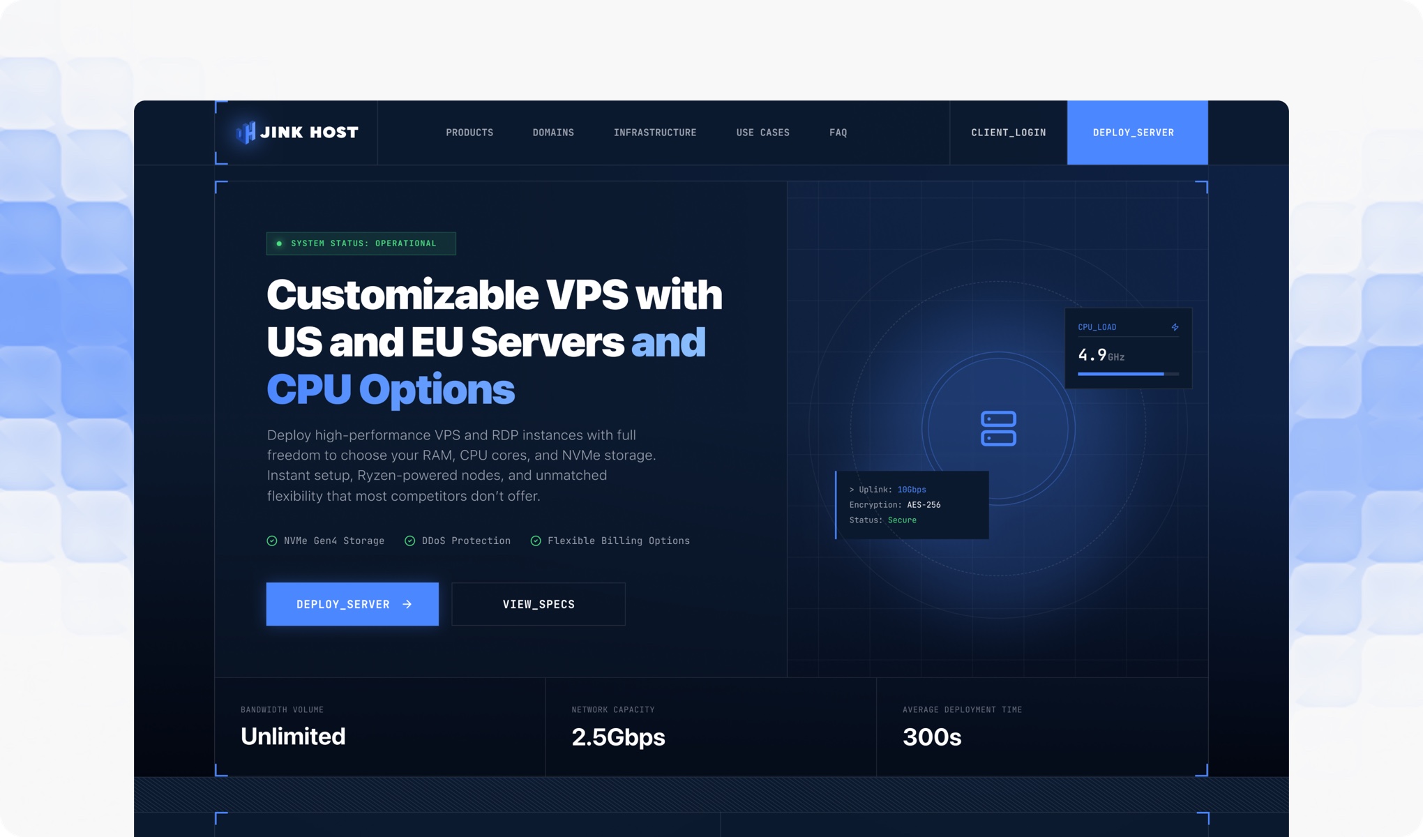
The challenge wasn't creating more information. It was deciding what information deserved attention first.
Too many things competing for the first impression
The brief came with a fairly broad product offering.
VPS and RDP were the main focus, but the website also needed to introduce dedicated servers, cloud storage and domains. The client also wanted to highlight EU and USA server locations, Budget and Premium CPU options and a custom VPS configuration.
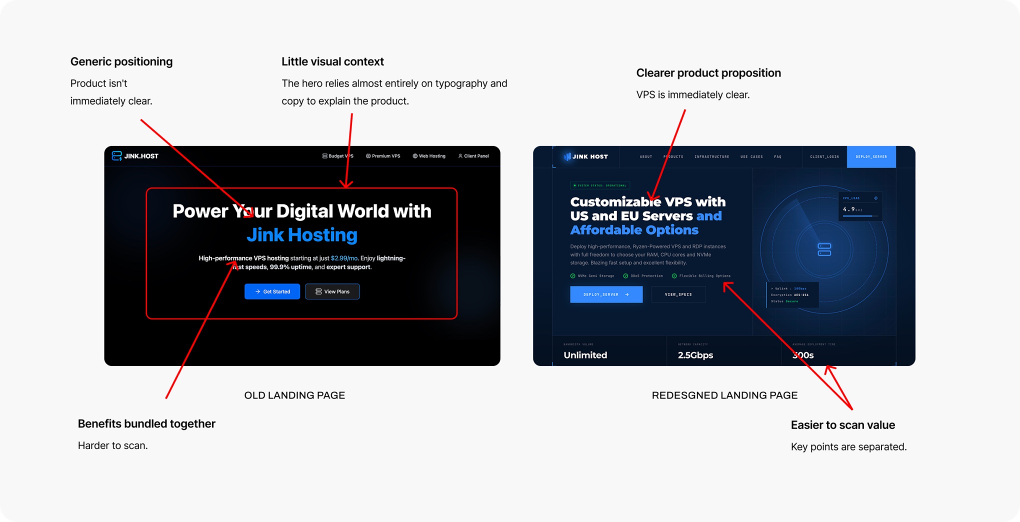
Every one of these things could become a section. But giving everything the same visual weight would make the page harder to understand.
So I started with a simpler question.
What does someone need to know before they're ready to choose a hosting plan?
That became the basis for the page hierarchy.
Didn't want the page to feel like a product catalogue
Hosting websites can easily turn into specification sheets.
CPU, RAM, storage, locations, plans, pricing and more specifications.
That approach gives users information, but it doesn't necessarily help them make a decision.
For Jink Host, I wanted the page to feel more like a guided introduction to the products.
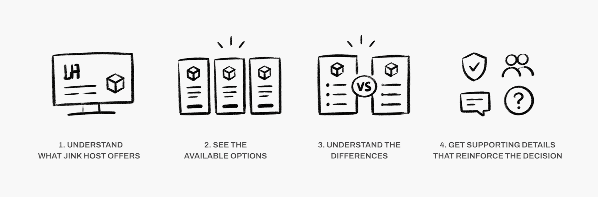
The client's original structure gave me the sections to work with. My job was to turn those sections into a progression.
The VPS section had a problem of its own
The VPS offering had several choices packed into it.
- EU or USA?
- Budget or Premium CPU?
- How much RAM?
- How many CPU cores?
- How much storage?
And then there was the custom VPS option, where users could build their own configuration. The client specifically wanted this flexibility to stand out as a differentiator.
The challenge was making those choices feel manageable.
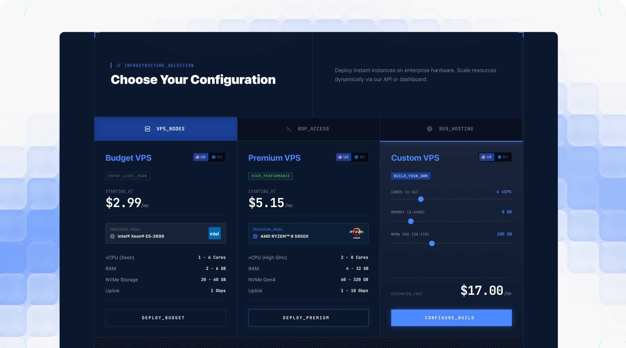
I didn't want users to have to understand every specification before they could figure out what was relevant to them.
The configuration should feel like a choice, not a technical exam.
That became an important consideration in how I presented the VPS options.
Designing within an existing identity
The visual identity was already established before I started the landing page.
The logo, typography and core colour palette had already been defined, giving me a visual foundation to work with rather than something I needed to create from scratch.
My job was to take that identity and translate it into a complete digital experience.
The challenge was making the existing visual language work across a page with a lot of technical information without letting the interface become visually heavy.
I kept the core identity intact while using hierarchy, spacing and layout to give the content more room to breathe.
The brand didn't need to change. The way it was presented needed to work for the web.
Designing something that could actually be built
There was another consideration that wasn't visible in the final design. Jink Host already had an existing setup, including WHMCS compatibility, and the new website needed to work within that environment.
So I wasn't designing a completely isolated concept. I had to think about how the page would behave as a real website.
Figma was only half of the job
Once the design was established, I vibecoded the landing page myself. This changed the way I looked at the design.
A layout can look perfectly balanced in Figma and feel completely different in a browser.
Spacing changes. Text wraps differently. Sections become much taller on smaller screens. Interactions need to make sense.
So instead of treating development as the final step, I used the vibecoded version to refine the design itself.
The browser became another design tool.
The result wasn't about adding more
The final landing page brings Jink Host's products, VPS options, configurations and supporting information into one experience.
But the goal wasn't to show everything at once. It was to gradually answer the questions a visitor is likely to have.
- What does Jink Host offer?
- What should I choose?
- What makes the options different?
- Why should I trust them?
And finally:
- Where do I go from here?
The result is a landing page that gives the business room to communicate a fairly complex product range without making the experience feel equally complex.
Less about showing everything. More about showing the right thing at the right time.