Improving scannability in a proxy dashboard
Surfaced product variety and simplified data usage display, helping customers compare options and find what they need faster.
My Role
UI UX Designer
Responsibility
Information architecture (IA), visual hierarchy
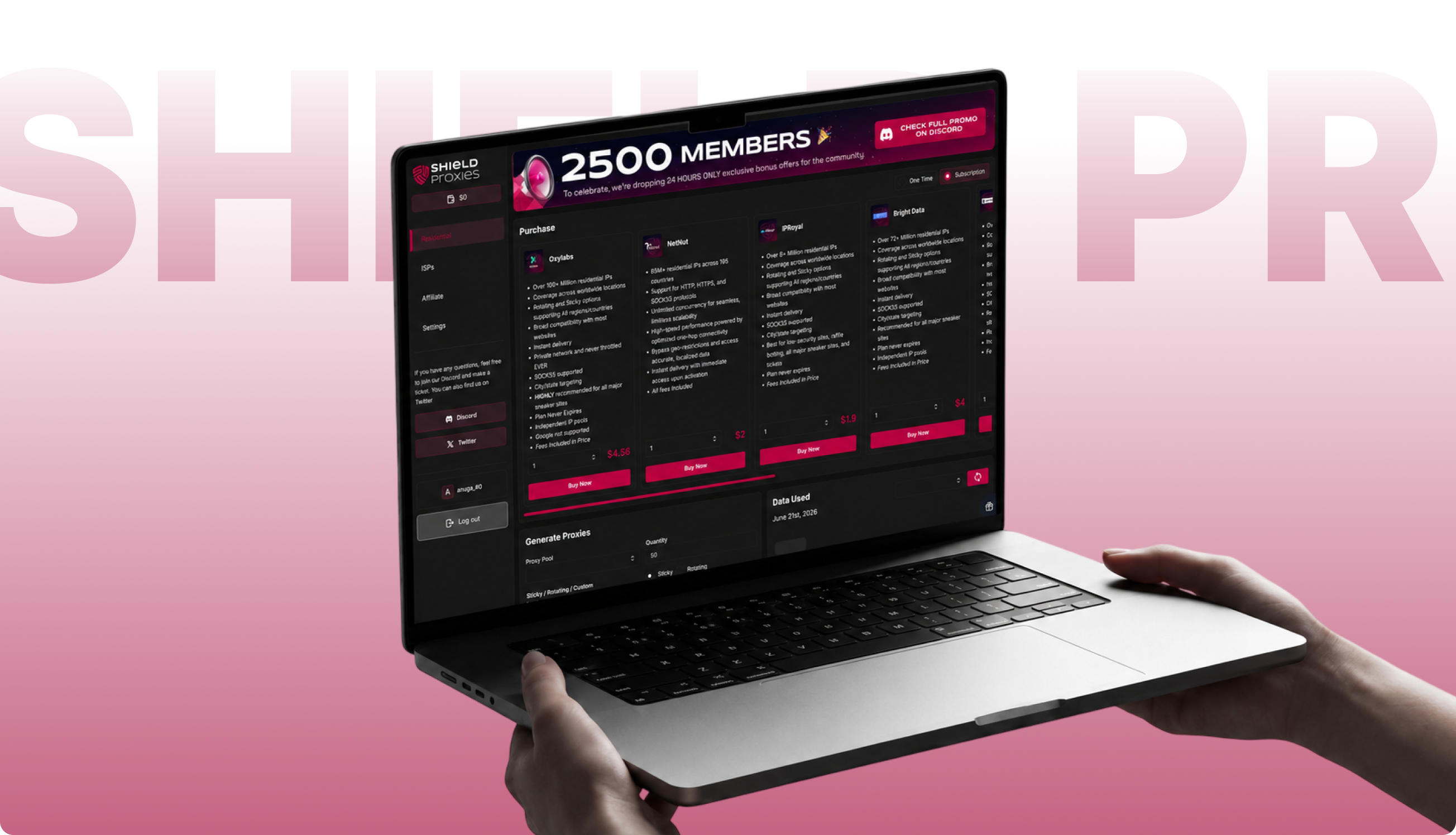
Shield Proxies, a B2B residential/ISP proxy platform. The dashboard is where users purchase proxies from multiple providers, configure and generate proxy lists, and manage their account.
The old dashboard wasn't broken, but it had functional gaps in IA and visual hierarchy issues. The active nav state relied on a thin underline beneath the current link, which got lost against an already busy layout.
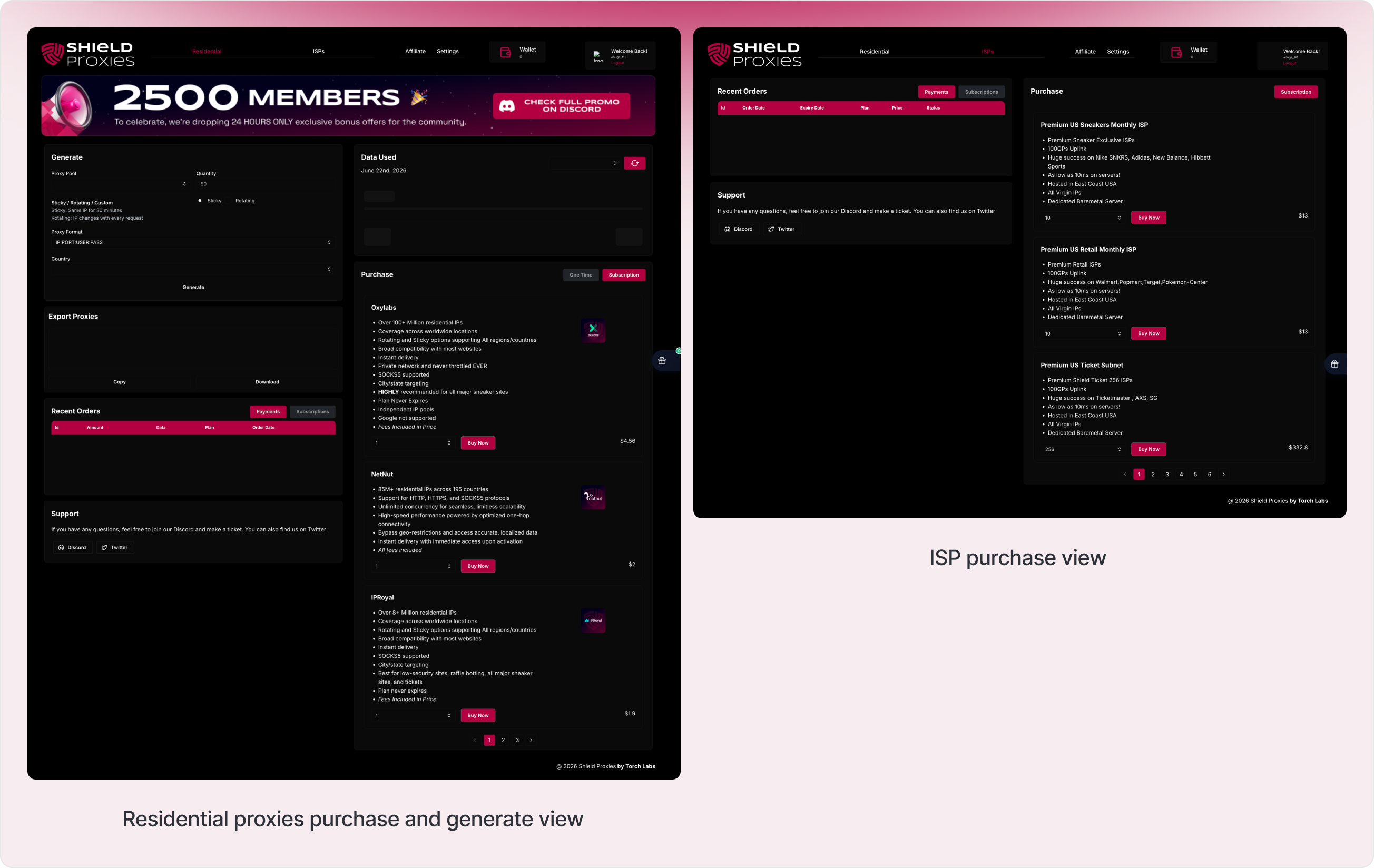
The provider comparison flow was paginated, only three of five vendor cards showed at once, so comparing pricing or features meant clicking through pages and remembering what you saw on the last one.
Inside each card, the price was technically grouped with the rest of the content, but low contrast and loose spacing made it read as a separate, floating element rather than part of the card. And the purchase module, the main conversion point on the page sat below secondary tools like Generate Proxies and Data Used instead of leading the page.
None of this was broken. It just asked people to work harder than they needed to and the page didn't feel like one connected system.
Before touching any visuals, I worked through the structure first. The two questions driving it: what should the user see first and how do I let them compare all five providers without clicking through anything.
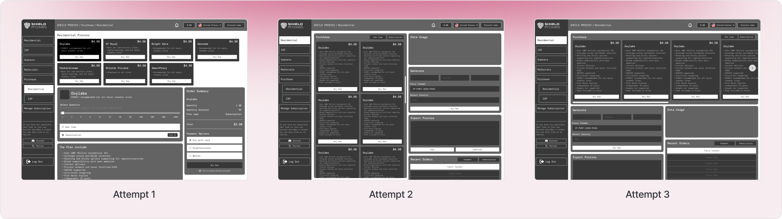
The main structural decisions:
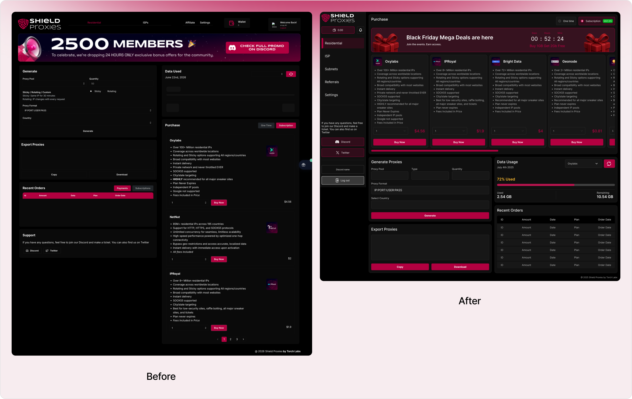
- Move navigation into a sidebar that stays visible at all times, with a stronger active-state indicator than a thin underline.
- Drop pagination entirely and show all five providers in one row, so comparing them takes zero clicks.
- Put the Purchase section at the top of the page, since that's the action that matters most.
- Tighten the spacing and contrast around price, quantity, and the buy button so they read as one grouped unit inside each card.
What changed (UX)
- The old nav marked the active page with a thin underline present, but easy to miss. The new sidebar uses a left accent bar plus a highlighted background so you can tell where you are at a glance.
- Purchase now comes first. Generating proxies and checking usage data come after, since buying is the actual reason people are on this page.
- The old version paginated through three cards at a time. The new design shows all five: Oxylabs, NetNut, IPRoyal, Bright Data and Geonode in one row, so comparing the full lineup takes no clicks.
- Wallet, profile and logout used to live in different corners of the page. Now they're all together in the sidebar. One place to manage your account instead of three.
What changed (UI)
- The price was already inside the card, but low contrast and loose spacing made it look separate from it. In the new design, tighter spacing and stronger contrast pull the price, quantity, and buy button into one clearly grouped block.
- Swapped the underline for a left accent bar and highlighted background, a much clearer signal of where you are.
- Every binary choice in the app: sticky/rotating, one-time/subscription, payments/subscriptions now uses the same pill-style toggle, instead of feeling like separate, unrelated controls.
- Turned the wallet into a pill shaped button that matches the rest of the sidebar, instead of a plain box that looked out of place.
The redesign turns a page that felt like a few separate tools stuck together into one connected system, a clearer sense of priority, faster comparisons across providers and a UI where related pieces actually look related instead of floating apart.